
Build Your First Intune Power BI Dashboard Using OData
Not another 'what is Power BI' post. The full journey from the Intune Data Warehouse to a published dashboard, with real entities, relationships, and DAX.
Automating an Intune compliance report with PowerShell and Graph is one way to turn raw device data into something a manager can actually read. This is the other one, and it's the one built for genuine self-service reporting: connect Power BI directly to Intune's own reporting data store and build a real dashboard, not a static export.
Microsoft Intune
      ↓
Intune Data Warehouse
      ↓
OData Feed
      ↓
Power BI Desktop
      ↓
Power Query
      ↓
Data Model
      ↓
Relationships
      ↓
DAX
      ↓
Dashboard
      ↓
Power BI Service
Stage 1-2: Microsoft Intune and the Intune Data Warehouse
Power BI never connects to live Intune operational data directly. It connects to the Intune Data Warehouse, a separate, reporting-optimised copy of that data, refreshed on its own schedule, specifically so heavy analytical queries never compete with the actual MDM service managing real devices.
Open the Intune admin centre
Navigate to Reports → Data warehouse.
Copy the OData feed URL
This page shows the tenant-specific feed URL. Copy it, you'll paste this directly into Power BI in a moment.
Confirm you have the right role
Reading from the data warehouse requires an account with sufficient Intune RBAC permissions (an Intune administrator role, at minimum read access to devices and reports). A account without this will authenticate successfully but see no data.
This is not real-time data
The warehouse refreshes on its own cycle, not continuously. A device that enrolled ten minutes ago won't necessarily show up yet. Build dashboards for trends and posture, not for "what's happening right this second," that's what the Intune admin centre itself is for.
Stage 3: The OData Feed and What's Actually in It
OData is a REST-based protocol for querying data over HTTP, and the Intune Data Warehouse exposes its schema as a set of queryable entities. The ones that matter for this dashboard:
| Entity | What it holds |
|---|---|
devices | One row per managed device: platform, OS version, manufacturer, model, compliance state, enrollment date |
dates | A standard date dimension table, used to build any time-based trend |
ownerTypes | Corporate vs personal ownership classification |
enrollments | Enrollment events, including enrollment type and timestamp |
deviceCompliancePolicyStates | Per-device, per-policy compliance results |
Exact column names vary by tenant and API version
Microsoft occasionally revises the warehouse schema. Treat the entity and column names above as a map of what to look for, not a literal copy-paste reference, and check the actual field list in Power Query once you're connected.
Stage 4: Power BI Desktop
Get Data → OData Feed
In Power BI Desktop's ribbon, Home → Get Data → OData Feed.
Paste the feed URL
Paste the URL copied from the Intune admin centre.
Sign in with an Organizational account
Choose Organizational account at the authentication prompt, not anonymous or a Microsoft account, and sign in with the account that has the RBAC role confirmed in Stage 2.
Select the entities you actually need
In the Navigator window, tick devices, dates, ownerTypes, enrollments, and deviceCompliancePolicyStates. Don't select every available entity, each one adds load time and model complexity you don't need for this dashboard.
Choose Transform Data, not Load
This opens Power Query, where the real shaping work happens before anything hits your data model.
Stage 5: Power Query
Rename columns for clarity
Raw warehouse column names are rarely dashboard-friendly. Rename as you go, OS to Operating System, ComplianceState to Compliance Status, whatever makes the eventual DAX and visuals easier to read.
Fix data types explicitly
Confirm date columns are actually typed as Date, not Text, this is the single most common reason a time-based visual silently fails to sort correctly later.
Remove columns you won't use
Every unused column is dead weight in the model. If a field isn't feeding a visual or a relationship, remove it here rather than carrying it forward.
Filter out rows you don't want in the dashboard
Retired or deleted device records, if the entity includes them, usually don't belong in a "current fleet posture" dashboard. Filter them out now, not with a DAX workaround later.
Close & Apply
This loads the shaped tables into the actual data model.
Stage 6: Data Model
Think of this as a small star schema: devices is your fact table, one row per device, and dates, ownerTypes, and the compliance entity are the dimension tables that give those device rows context. This mental model is what makes Stage 7 make sense, rather than just clicking lines between tables and hoping.
Stage 7: Relationships
Switch to Model view
The diagram view in Power BI Desktop's left-hand navigation.
Connect devices to dates
Drag from the device enrollment date field to the dates table's date key. This is what makes an enrollment trend chart possible at all.
Connect devices to ownerTypes
Link the ownership type field on devices to ownerTypes, so a device ID resolves to a readable "Corporate" or "Personal" label instead of a raw code.
Connect devices to deviceCompliancePolicyStates
Usually on a shared device ID field, this is what lets a compliance visual pull accurate per-device state.
Check cardinality on each relationship
These should all be one-to-many (one date, one owner type, one policy state row relating to many devices), with a single, predictable filter direction. A relationship pointing the wrong way is the most common reason a visual shows numbers that look almost right but aren't.
Stage 8: DAX
A handful of measures cover everything this dashboard needs. Write these in a new, dedicated measures table rather than scattering them across the model, it keeps the model organised as it grows.
Total Devices = COUNTROWS(devices)

Compliant Devices =
CALCULATE(
    COUNTROWS(devices),
    devices[Compliance Status] = "Compliant"
)

Compliance % = DIVIDE([Compliant Devices], [Total Devices])

Windows Devices =
CALCULATE(COUNTROWS(devices), devices[Platform] = "Windows")

iOS Devices =
CALCULATE(COUNTROWS(devices), devices[Platform] = "iOS")

Android Devices =
CALCULATE(COUNTROWS(devices), devices[Platform] = "Android")
Build the percentage measures, not just the counts
A card showing "1,412 compliant devices" means very little on its own. Compliance % next to it, backed by DIVIDE (which safely handles a zero denominator instead of erroring), is what actually tells a manager whether that number is good or bad.
Stage 9: The Dashboard
Total Devices
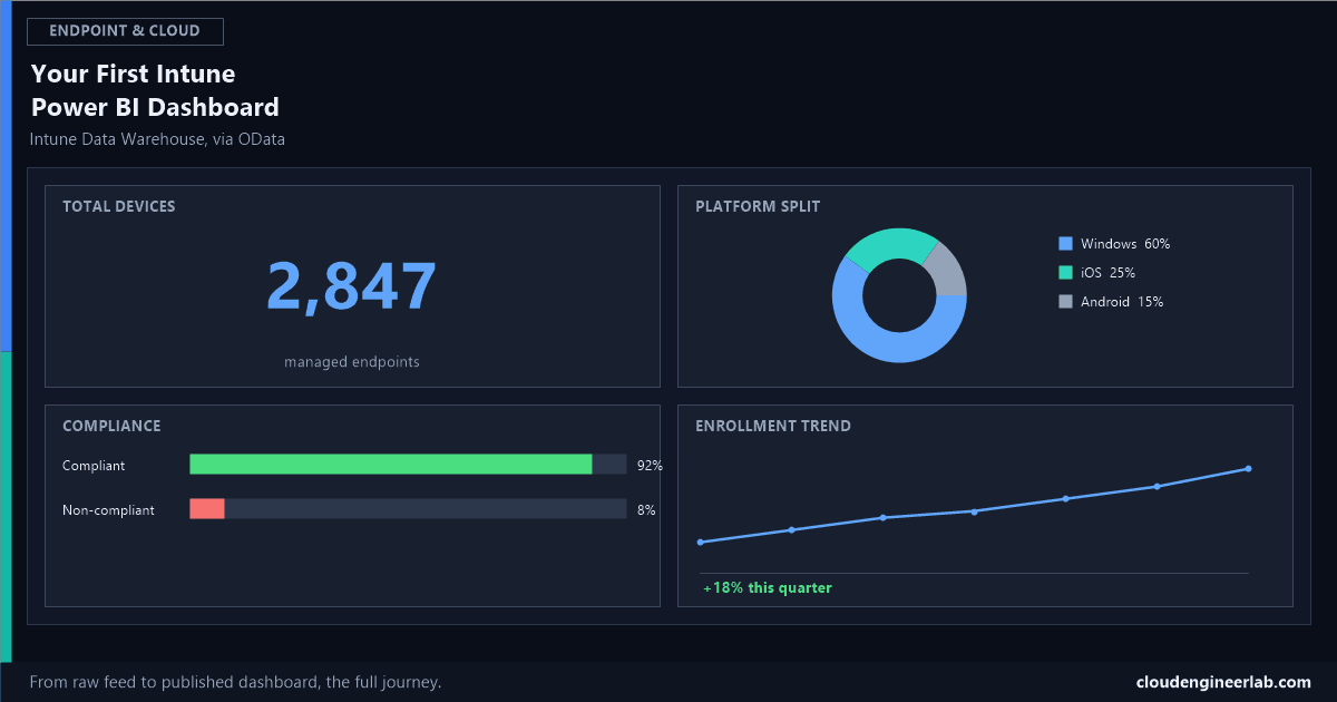
A single Card visual bound to the Total Devices measure. This anchors the whole page.
Windows / iOS / Android
A Donut chart with devices[Platform] as the legend and Total Devices as the value, giving an immediate read on fleet composition.
Device Ownership
A Bar chart with ownerTypes[Owner Type] on the axis and Total Devices as the value, Corporate vs Personal.
OS Versions
A Bar chart (or table, if the version list is long) breaking Total Devices down by the OS version field, the fastest way to spot a large population still sitting on an outdated build.
Enrollment Trends
A Line chart with the dates table's month field on the axis and Total Devices as the value, this is exactly why the Stage 7 relationship to dates had to be correct.
Compliance
A Bar chart or Gauge, Compliant Devices against Total Devices, or a simple two-category bar (Compliant vs Non-compliant) using Compliance %.
Manufacturer
A Bar chart with the device manufacturer field on the axis, useful for procurement and warranty conversations as much as security ones.
Platform Distribution
A Treemap or Matrix crossing Platform by Ownership, a slightly deeper cut than the simple donut, showing whether personal devices skew toward a specific platform.
Stage 10: Power BI Service
Publish from Power BI Desktop
File → Publish → Publish to Power BI, choosing the workspace this dashboard belongs in.
Configure scheduled refresh
In the Power BI Service, open the dataset's settings and configure a refresh schedule. Because the OData feed is itself a cloud HTTPS endpoint, this typically doesn't require an on-premises data gateway, just valid, saved credentials for the scheduled refresh to authenticate with.
Build a proper Dashboard on top of the report, if pinning visuals across pages
A Power BI Dashboard (distinct from the Report you built in Desktop) lets you pin specific tiles from one or more reports onto a single page for executives who want the headline numbers without navigating report pages.
Share through a workspace or an app, not individual file exports
Publishing to a workspace and distributing access through Power BI's own sharing model keeps everyone looking at the same live, refreshing data, rather than emailing a .pbix file that goes stale the moment it's sent.
Summary
| Stage | Where it happens | What you get |
|---|---|---|
| Intune → Data Warehouse | Intune admin centre | A reporting-optimised copy of device data |
| OData Feed | Intune admin centre | The queryable entities Power BI will connect to |
| Power BI Desktop → Power Query | Power BI Desktop | Clean, renamed, correctly-typed tables |
| Data Model → Relationships | Power BI Desktop, Model view | A working star schema, not just loose tables |
| DAX | Power BI Desktop | The actual measures every visual depends on |
| Dashboard | Power BI Desktop, Report view | Eight visuals answering real fleet-posture questions |
| Power BI Service | powerbi.com | A shared, scheduled-refresh dashboard, not a static file |
The version of this that actually gets used by a manager three months from now is the one where the relationships were built correctly in Stage 7 and the refresh was actually configured in Stage 10, not the one with the prettiest visuals on day one.
Which of these eight visuals did you find the most useful once it was actually live? Enrollment Trends is the one I see teams underrate going in, and lean on most once budget or procurement conversations come up. Drop a comment with what earned its place on your dashboard.

Written by
Chetan Yamger
Cloud Engineer · AI Automation Architect · Modern Workplace Consultant
Cloud Engineer, AI Automation Architect, and Modern Workplace Consultant based in Amsterdam, Netherlands. Specializing in scalable, secure enterprise solutions with Microsoft Azure, Intune, PowerShell, and AI-driven automation using ChatGPT, Gemini, and modern LLM technologies.
Stay in the loop.
New articles, straight to you.
Deep-dive technical articles on Intune, PowerShell, and AI — no noise, no spam.
Discussion
Share your thoughts — your email stays private
Leave a comment